

Rosalind Jana, blogger, writer, and model, writes about the changing fashions and looks in The Art of Romance
I’ve always been fascinated by the clothes that defined previous decades. As a teenager, a vintage Vogue was the height of excitement: insight into a sixties world of mini-dresses and huge eyelashes, or a fifties world of nipped-in waists and full skirts. I have countless books full of fashion photography and film stills from the Twentieth Century. Such a delectable treasure trove of looks and designs and amazing cuts.
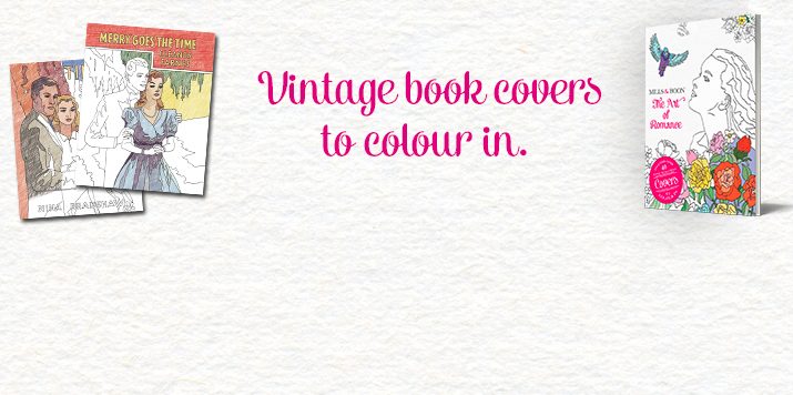
I still find it satisfying to roughly pinpoint when a certain item of clothing might have been made. It’s in the big picture (if it’s synthetic and covered in bright patterns, hello seventies!) and also in the details (is the zipper metal or plastic?) This is one of the reasons I found Mills & Boon’s ‘The Art of Romance’ colouring book so fascinating. Here the span of covers stretching over nearly a century, with their fantastically dramatic titles like ‘Beware the Beast’ (or, at the slightly more mundane end of the scale: ‘Romance Goes Tenting’), don’t just capture a nation’s changing interest in how they wanted their romance to look. They also give insight into the whims and changes in sartorial taste.
Take ‘Silvertide’, from 1959. Here the focus is on that killer swimsuit – and, admittedly, the rather unrealistic hourglass figure of the woman. I still love it though. It’s rather kitsch and totally, utterly of its time (maybe I just secretly want a swimsuit like that. In fact, I definitely do). Skip forward nearly two decades, and we have ‘Valley of the Moon.’ Here it’s a deliciously seventies vision: all those huge, pointed collars, floppy hats, and huge cuffs. Hit 1999’s ‘Contract Baby’ and there’s a strappy number that could almost qualify as a silk slip. Hop, skip, and jump all the way back to the 1920s, and there are flapper dresses and floral headpieces aplenty. Maybe I’ve just gone for the most obvious examples: the clothes that we can really easily read as being from a particular era. But they are such fun to chart: those slinky thirties gowns, or slightly boxy forties shoulders, or fifties cocktail gowns worn by women staring off into the distance (‘Begin to Love’: I’m looking at you). And that’s before we get to the many, many hairstyles that shift with the mood of the decade too. From cropped bobs all the way through to long locks.
There’s something about having to colour in an illustration that forces you to scrutinize it closely – to look at the particular line of a skirt, or notice the arrangement of buttons on a top. It makes you stare at images that otherwise might be given a single glance, lingering on the details. Here it was rather amazing to flip back to the front of the book, and see the actual covers, with their vibrant blues and reds and greens (and I was even more enamoured with that polo-neck on the front of ‘Romance Goes Tenting’ on finding out it was originally orange). But that’s the fun here: the chance to re-imagine the clothes. Perhaps give them brilliant new patterns, or change what was originally a tasteful dusky pink into something neon-bright. The chance to play around with the familiar, making it new.
Thanks so much to Rosalind for writing our blog today! Her debut book Notes on Being Teenage is published this month. You can follow her on twitter and read her blog here.
